How to Make a Bar Graph in Excel
Microsoft's Excel program allows you to build spreadsheets with mathematical formulas that adjust data according to your instructions on an ongoing basis.
A bar graph is a graph based on
numerical data that allows you to show proportions in a Bar Graph.
You
can learn how to make a bar graph in Excel and modify it for your report or
presentation.
Open Microsoft Excel on your Computer.
1. Click On :New" at the left side
2. And click on the "Create" button at the Rightside
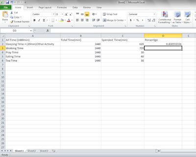
Enter information and Data in the cells that you will use.
Enter your time that you Spend in 24hrs (1440min) in different activity such is
| Sleeping Time + (20min)Other Activity | |||||||||||||||||
| Working Time | |||||||||||||||||
| Pray Time | |||||||||||||||||
| Eating Time | |||||||||||||||||
| and Tea Time |
Mostly its depend on your daily lifestyle, You can inter them in your manner i only suggest them.
Enter the time you spend in 24 hrs.
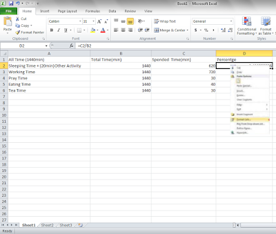
type the formula =C2/B2in cell D2 and hit Enter.when you will do this,Excel will automatically.
Press Enter.
Format your cells in the column according to whether they are
words numbers, Date, Time, Percentage, Currency,
Fraction, Scientific, Text, Special and Custom,
Highlight a group of cells by
clicking on 1 cell and dragging it with your mouse until you've covered all the
desired cells. You can also click on the letter at the top of the column or
number at the row, to select an entire column or row.
Right click on the selected cells and
click "Format Cells".
Click On “Percentage” to
indicate what value you will want to ADD .
Click OK
And then the value should be convert to the percentage value.
Look for the small box with a plus
sign that pops up near the bottom of those cells. Click the arrow and choose
"Fill Formatting Only." This will copy the type of formula you have
just used, but move the values to the correct vertical row.
Select the data that you would like
to use in the pie chart. Use your mouse cursor and drag it over both columns
and all the rows that are included. Make sure it does not highlight a separate
data series.
1. Click on the Insert that i Highlighted.
2. and Then Click on the Bar.
there is also other type of Bar Graph which is
2D-Bar, 3D Bar, Cylinder Bar, Cone Bar, Pyramid Ba r or an other Bar Graph Chart.
Press"OK".


 #ref-menu


